B2C · Visual Identity · Reservation Platform · Mobile UX
Tabling BX/UI Redesign
Tabling is a remote waitlist and reservation platform that helps improve the restaurant visiting experience. However, compared to competitors, Tabling lacked a distinctive presence.
I repositioned Tabling around helping users make use of their waiting time, then developed a character-based identity and app flows for restaurant discovery, reservations, and nearby exploration.
Brand Strategy
Research & Discovery
To understand Tabling’s current brand perception and identify opportunities for improvement, I analyzed its existing identity system, user touchpoints, and competitive landscape.
Through user reviews and feedback from app platforms and online communities, I evaluated how effectively Tabling’s brand experience communicated its unique value and positioned itself within the market.

A Differentiation That Was Not Clearly Communicated
User reviews and feedback revealed that many users did not clearly recognize Tabling’s differentiation from competitors such as CatchTable. Despite its unique remote real-time waitlist service, this key value was not effectively communicated through the overall brand experience.
A Limited Identity System Across Touchpoints
User feedback also showed that users were largely unaware of Tabling’s broader identity beyond its logo. The existing youthful portrait-based identity lacked a clear narrative and flexibility, limiting its application across digital and offline touchpoints.
Brand Strategy
Brand Direction

User Persona
Inspired by users’ behaviors and emotions while waiting.

Dynamic Movement
Visualizing a Seamless Journey Through Fluid Line-Based Visuals

Playful Expression
Creating an engaging brand experience through onomatopoeic elements.
Redefining Waiting as an Experience
Rather than positioning waiting as a passive inconvenience, I identified an opportunity to transform waiting into an engaging experience where users explore, discover, and anticipate their next destination.
The new brand strategy focused on visualizing user behaviors and emotions throughout the waiting journey, creating an identity system that reflects Tabling’s unique service experience.
Creating a Memorable Brand Experience
By combining dynamic movement and playful expressions, the identity system was extended across various touchpoints, creating a distinctive and engaging brand experience.
BRAND EXPRESSION
BX Expression
Visualizing the Waiting Journey Through Movement
To translate the waitlist service experience into a visual identity, I developed a line-based character inspired by users’ behaviors while waiting.
The character’s gestures were combined with flexible line elements to visualize users’ movement throughout the waiting journey. This transformed an invisible service experience into a recognizable brand expression.
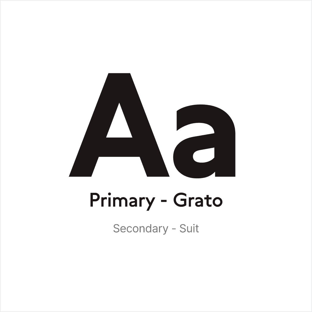

Typography & Color System
The curved typeface and vibrant orange color system were selected to reinforce Tabling’s energetic and approachable personality.

A Scalable Brand Identity Across Touchpoints
Beyond the character illustration, the flexible line-based motif can be applied as a simple graphic element. This scalable visual system allows the brand identity to adapt across various touchpoints while maintaining consistency.
Digital STRATEGY
Digital Experience Direction
As dining habits evolved after the pandemic, digital waitlist services became an essential part of the restaurant experience. The market continued to grow as users increasingly adopted digital solutions for managing restaurant visits.
However, despite the growing demand for waitlist services, Tabling showed weaker performance compared to competitors, with lower app ratings and higher customer churn.
To understand the reasons behind user drop-off, I conducted in-depth interviews with highly engaged users and analyzed their usage patterns, behaviors, needs, and pain points throughout the user journey.

Limited Discovery Experience
The Home and Search screens offered limited content and few ways to filter restaurants by users’ preferences and needs.
Inefficient Reservation Experience
Users could not check reservation availability for their preferred date before entering the restaurant detail page, making the reservation process less efficient.
Untapped Waiting Experience
After joining a waitlist, users often dropped off naturally, and in many cases, this eventually led to account deletion.

EXPERIENCE DESIGN
Home & Search Redesign

Expanding Restaurant Discovery
Previously, the Home experience focused primarily on nearby restaurants and ranking-based content. I proposed curated content and themed collections to encourage exploration beyond direct search.
Refining Search & Filtering
Previously, users had limited options to refine restaurant results based on their preferences and needs. I designed detailed filters and advanced search options to support more efficient restaurant discovery.
EXPERIENCE DESIGN
Reservation Redesign

Making Reservations More Predictable
Previously, reservation availability and wait times were only visible after users entered a restaurant's detail page. The proposed design surfaces reservation availability and AI-powered wait time estimates in the listing view to help users make more informed decisions.
EXPERIENCE DESIGN
Explore Nearby

Turning Wait Time into Exploration
I proposed a map of nearby places and a planning feature to help users make use of their waiting time. These features give users a reason to return to Tabling after joining a waitlist and extend the service beyond reservations.
EXPERIENCE DESIGN
My Tabling

Visualizing Users’ Journey with Tabling
My Tabling brings together reservation history, coupons, points, and time saved through remote waiting, making the benefits of using the service visible in one place.
OUTcome